
When it comes to tile installations, grout color is often an overlooked detail, yet it plays a crucial role in the overall aesthetic and functionality of your space. Grout is not just a filler between tiles; it serves as a transition that can either harmonize with or highlight your tile design. I believe that understanding the importance of grout color can transform a simple tile project into a stunning visual masterpiece.
The color of grout may have different impacts on the appearance of your tiles. As an example, grout can be selected to match your tiles, which will give a smooth appearance and make the place look bigger and more unified. Conversely, different grout may be used to emphasize the tiling shape and pattern, which gives depth and interest to the surface. Thus, the grout color cannot be selected blindly and must be a well-planned, design-enhancing strategy.
In addition, the color of grout also has its practical applications. Some colors are more tolerant to dirt and other stains, and this is a crucial factor to consider in high traffic or areas that can be easily subject to moisture, like a kitchen and a bathroom. Selecting a suitable grout color does not only add value to the aesthetic quality of your tiles but also adds to the overall maintenance and longevity of the installation.
When choosing the perfect grout color, there are many variables that may affect the aesthetic and practical side of the tile installation. The style and general design of your space is one of the initial things to consider. Depending on your desired theme of either a modern minimalistic or traditional rural style, the grout color will either emphasize or deemphasize your theme.
The effect of lighting in the room is another significant aspect of the perception of the grout color. Lighter grout colors are more vibrant when they are used in areas with a lot of natural light whereas darker grout colors are more subdued. On the other hand, darker grout may look so contrasty in low-light settings whereas light grout might look washed out. Thus, it is crucial to evaluate the setting to attain the desired effect.
The other important consideration is the practical use of the space. An example is when in a busy kitchen, a darker grout may be desirable because it will not easily be stained by food spills. Communally, a clean bathroom would perhaps be happy with a lighter shade of grout to create an impression of purity and freshness. Through these factors, you will be able to make an informed choice that will provide a balance between form and function in the tile installation.

Grout colors can dramatically alter the appearance of your tiles, and understanding the effects of popular choices can guide you in making the best decision for your space. Here are some of the most frequently used grout colors and their aesthetic impacts:
White Grout:This is a classic option and is ideal in developing a clean and crisp appearance. It works well with white or light colored tiles and gives them a smooth look or dark tiles that creates a dramatic effect. However, it must be maintained frequently to retain its clean look.
Gray Grout: Gray is offered in different colors and it is a flexible choice that matches with most of the tile colors. It is able to balance and neutralise the harshness of white tiles, or the harshness of dark tiles into a more neutral background.
Black Grout: Black grout is the best in creating a statement because it gives a space its depth and drama. It is very effective with the bold or colorful tiles that emphasize the complex patterns and designs.
Beige and Tan Grout: These are both very warming and inviting color activities that are good to create a very cozy atmosphere. They combine very well with natural stone tiles, and tolerate dirt and stains.
Learning these trendy grout colors you can successfully customize the appearance of your tiles in accordance with the overall space design and obtain the expected look.
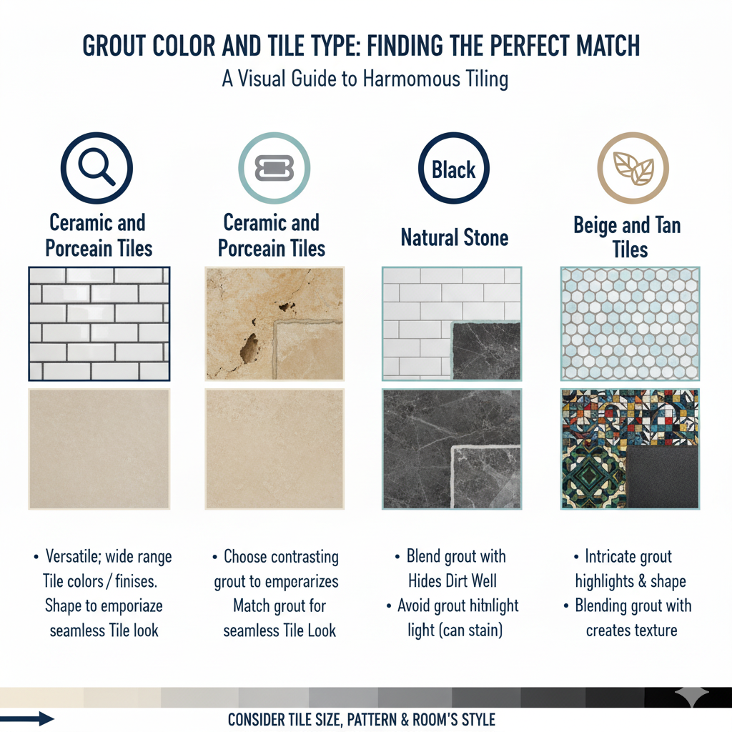
The correlation between the type of tile and the color of grout plays a central role towards coming up with a complementary and attractive design. The different colors and materials used on tiles may determine the grout used, which will impact both on the aesthetics and functionality of the installation. We will discuss the ways of matching the grout and tile perfectly.
These multipurpose tiles come in a variety of colors and finishes, and it is possible to create a combination of grout colors. In order to create a smooth look, I tend to suggest grout that is as similar as possible to the tile color. Alternatively, the tile pattern can be highlighted by a contrasting grout to provide visual appeal to the surface.
Natural stone tiles have their own distinctive feel and natural look due to their natural grout colors, thus contributing to the natural beauty. The warm colors of stone are then combined with earthy tones such as beige or tan, and the veining and patterns of the stone may also be highlighted with gray grout.
Mosaic tiles often feature intricate designs and vibrant colors, making grout color an essential consideration. A neutral grout can unify the mosaic's diverse elements, while a contrasting grout can highlight individual pieces, creating a striking mosaic effect.
Grout color is another crucial factor because mosaic tiles usually have sophisticated designs and even bright colors. An neutral grout can balance the heterogeneous aspects of the mosaic whereas a contrasting grout can emphasize separate pieces, forming a powerful mosaic impression.
By carefully considering the tile type and its inherent characteristics, you can select a grout color that not only complements the tiles but also elevates the overall design of your space.
The grout color is not only a matter of style, but it influences the mood and the atmosphere of a room. Certain colors may produce different moods and impressions, and it is extremely important to think of the intended atmosphere during grout choice.
Light grout colors are perfect in areas that need the light and airy appearance, e.g. bathrooms, marine-themed rooms. They are reflective and open the space and make it look spacious, which is an increase of the space brightness.
Warm colored grouts like beige and tan are ideal in spaces where comfort and warmth are more important like the living room or the kitchen that is a rustic one. They make the atmosphere welcoming and cozy, which makes the area friendly and comfortable.
Dark grouts such as black or deep gray will provide a dramatic and elegant touch to a room to people who want to be bold. These colors have a great contrast with the lighter tiles and they give it an impressive and elegant appearance.
Knowing the effect of the grout color on the mood of a room, you will be able to provide the atmosphere that corresponds to the mood you would like to have and makes this room become a part of the total design.
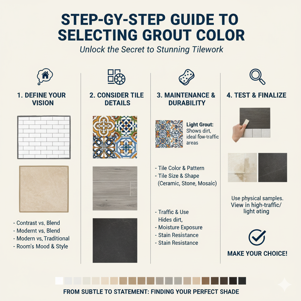
Choosing the right grout color can be a daunting task, but breaking it down into manageable steps can simplify the process. Here's a step-by-step guide to help you select the perfect grout color for your tile project:
Identify Your Design Goals: Decide on the overall look and feel that you desire in your space. Take into consideration such aspects as style, mood, and the color palette.
Consider Tile Type and Color: Determine what kind of tiles you are working with and what their color and pattern are. Choose whether you would like the grout to match perfectly or offer contrast.
Assess Lighting Conditions: Determine the room lighting to determine its impact on the appearance of the grout color. Take into account the sources of natural light and artificial light.
Test Grout Samples: Get some grout samples of different colors and put them on a small part of your tile installation. Note their appearance in various lights and at various times of the day.
Evaluate Practical Considerations: Give attention to the functionality and maintenance requirements of the room. Select grout color that will be used and one that is easy to maintain depending on the use of the space.
Make a Decision: Select the grout color which best fits your design objectives and real-world requirements based on the observations and assessments.
By following this step-by-step guide, you can confidently select a grout color that enhances your tiles and elevates the overall design of your space.
Selecting the wrong grout color can undermine the beauty of your tiles and affect the overall design of your space. Here are some common mistakes to avoid when choosing grout color:
The effects of lighting on the color of grout is one of the most frequent errors. It is necessary to evaluate the impact of natural or artificial light on the look of the grout and make corrections.
Grout color should not be selected based on aesthetic appeal. Overlooking the practicality of such considerations as maintenance and stain resistance, may result in frustration and subsequent upkeep in the long term.
The lack of attention to the pattern and design of a tile may lead to a fragmented appearance. Make sure that the color of the grout is matching the tile pattern and adds to its visual interest.
With the awareness of such pitfalls, you can know all the possible pitfalls and make a sound decision to improve the beauty and utility of your tile installation.
Testing grout color before committing is a crucial step in ensuring satisfaction with the final result. Here's how to effectively test grout color:
Obtain Grout Samples: Buy small quantities of grout in many different colors you are considering using in your project.
Create Sample Boards: Take the grout samples and paste them on small boards or tiles and make mock-ups. This will enable you to view the interaction of each of the colors with your tiles.
Evaluate Under Different Conditions: Put the sample boards into the room to which the tiles will be placed. Notice the appearance of the grout in various lighting situations and during various times of the day.
Seek Feedback: Ask your friends or family to share their feedback on the grout color options to have a new set of eyes on the colors.
Make an Informed Decision: Decide based on the observation and the feedback you have received which grout color will suit your design objectives and practical requirements best.
By testing grout colors before committing, you can ensure that the final result meets your expectations and enhances the overall design of your space.
Maintaining the freshness and vibrancy of your grout color is essential for preserving the aesthetic appeal of your tile installation. Here are some maintenance tips to keep your grout looking its best:
Regular Cleaning: To avoid accumulation of dirt and stains, clean your grout on a regular basis using a soft brush and mild detergent.
Seal the Grout: Use grout sealer to prevent stains and moisture. Periodically apply the sealer as suggested by the manufacturer.
Address Stains Promptly: Tackle stains as soon as they occur to prevent them from setting into the grout. Use a gentle cleaner and avoid harsh chemicals that can damage the grout.
Avoid Scrubbing with Abrasive Tools: Use soft brushes or cloths when cleaning grout to avoid scratching or damaging the surface.
With these tips in mind, you will be able to maintain the grout color fresh and vibrant, and have your tile installation go on contributing to the beautification of your space.
In conclusion, selecting the appropriate grout color is an extremely significant process of making your tile installation both beautiful and functional. With a choice of grout color which matches your tiles and works to enhance the overall design of your space, you can make a good choice when choosing a grout color based on design objectives, the type of tile, and the amount of lighting needed.
It is important to remember that the color of grout has practical implications too, which influence the maintenance and durability. Therefore, you can be sure that you will be happy with the end product by preventing the usual mistakes and trying colors of the grout before making a decision.
In the end, a simple tile project can be turned into a beautiful piece of visual art with appropriate color of grout as it will improve the mood and style of your environment. When you are ready to start the job of laying tiles, you may want to spend some time and think out your choices of grout colors and make a wise choice that adds to your vision.
Lighter grout colors, such as white or light gray, reflect more light and create a seamless effect, making small rooms appear larger and more open.
Gray grout is usually the easiest to maintain because it hides stains better than white but doesn’t show soap scum or fading as quickly as black.
Yes. Neutral grout shades (like gray, beige, or white) are more appealing to buyers because they’re versatile and timeless, while bold colors may not suit everyone’s taste.
Absolutely. Grout acts like a frame around your tiles. Light grout vs dark grout creates completely different effects light blends tiles together, while dark highlights their shape.
Specialty or colored grout options (like metallic or custom shades) can cost more than standard neutrals, but they offer unique design impact.
Dark grout (like charcoal or black) hides dirt and stains best, making it ideal for high-traffic areas, though it may lighten slightly over time.
For busy or bold patterns, it’s best to use a neutral grout shade (gray, beige, or off-white) so the design remains the focus.
Yes, grout stains and colorants can refresh or completely change your tile grout colors without replacing tiles.